Make the purpose immediately understandable
If a welcome message, seating list and guestbook share one table, give each a recognisable place. Consider what guests should notice first and where they approach next. A heading, explanation and name list do not need identical visual emphasis; organise information by its purpose.
Judge the name list using a real print or a full-size sample at the venue, not just a computer screen. A heading visible across the room does not prove that smaller names are readable. Note necessary changes before finalising the surrounding decoration.
Frame the information and leave working space
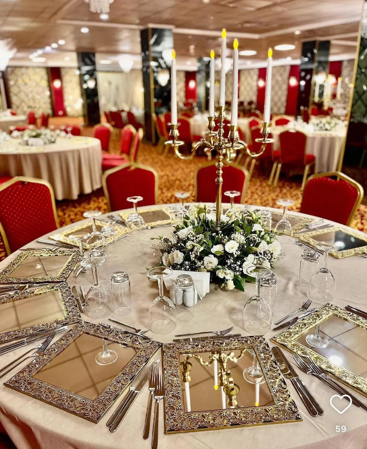
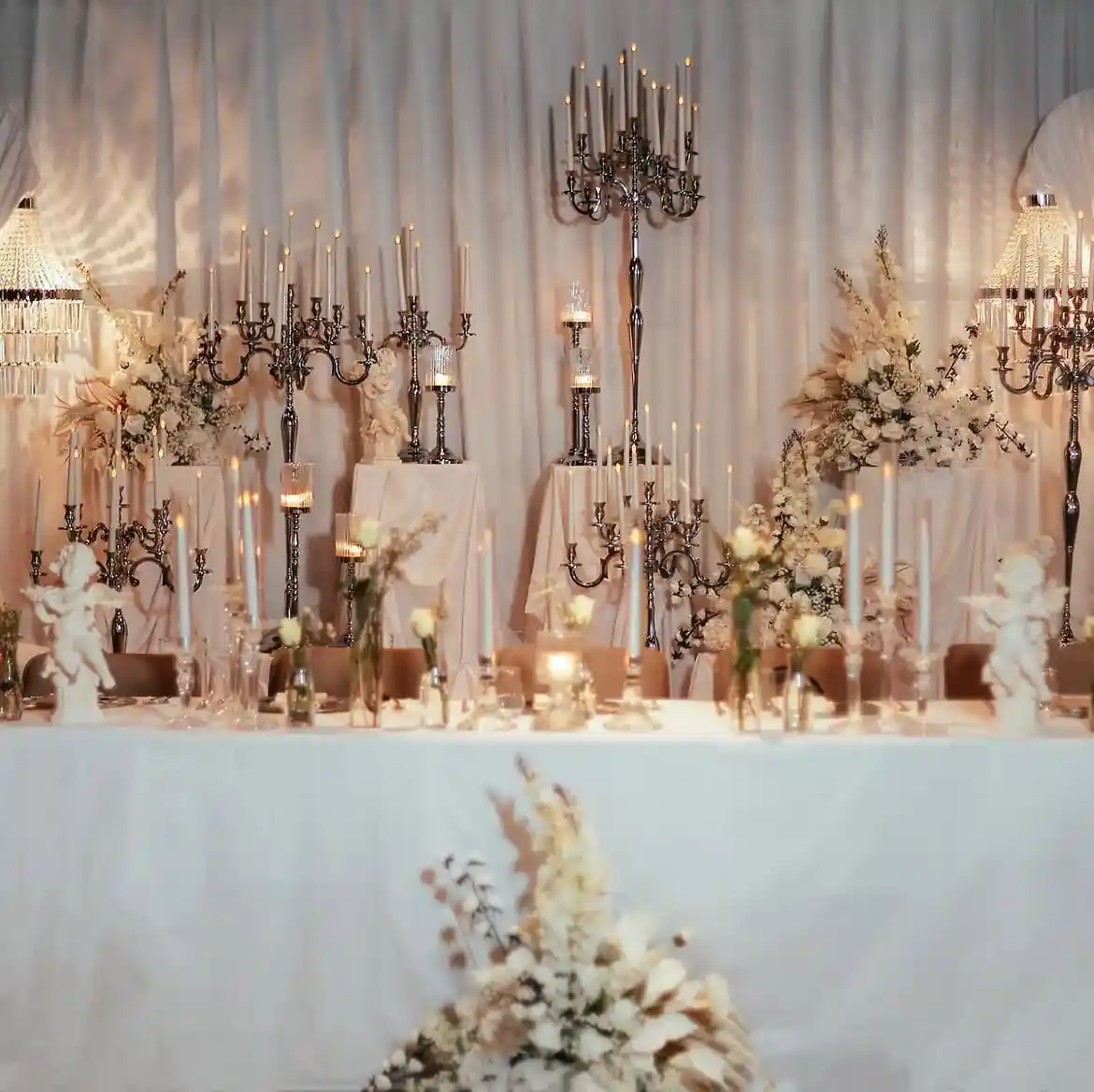
Try positioning a vase or candleholder beside the written information rather than in front of it. Account for the final volume of flowers, not only the empty vase. Decoration can emphasise an edge or corner while leaving the wording unobstructed.
For a guestbook, consider the space occupied by the open book, the pen and a person writing. Any additional space needed for belongings depends on the setting. Actually completing those tasks reveals obstacles that an attractive front-facing photograph may not show.
Keep the arrangement usable when information changes
Seating lists can change late in the process. Agree which file is current and who replaces the print. Review whether a card or list can be changed without dismantling the entire arrangement. Pair the final photograph with a dated setup note.
Include links to the selected Glassy vases or candleholders in that note. Signs, printing, flowers and stationery shown in an inspiration image are not automatically part of a product purchase. Identify each element separately and share the relevant product and placement questions when discussing an order.