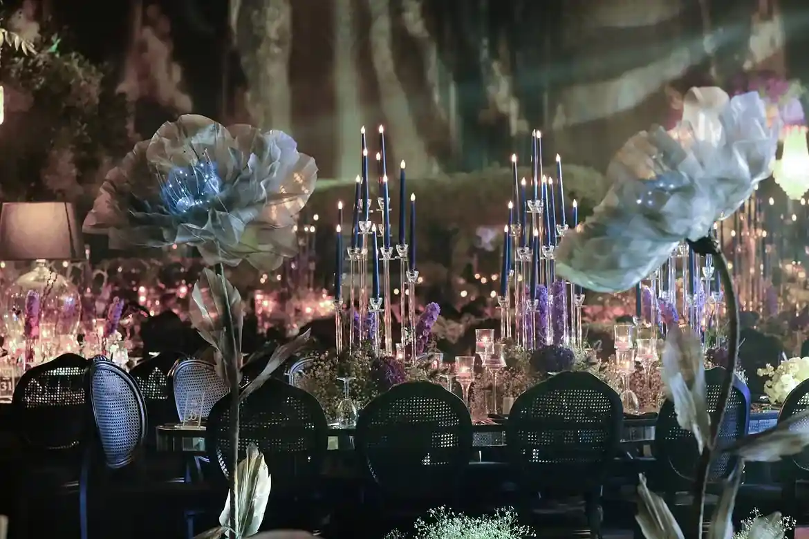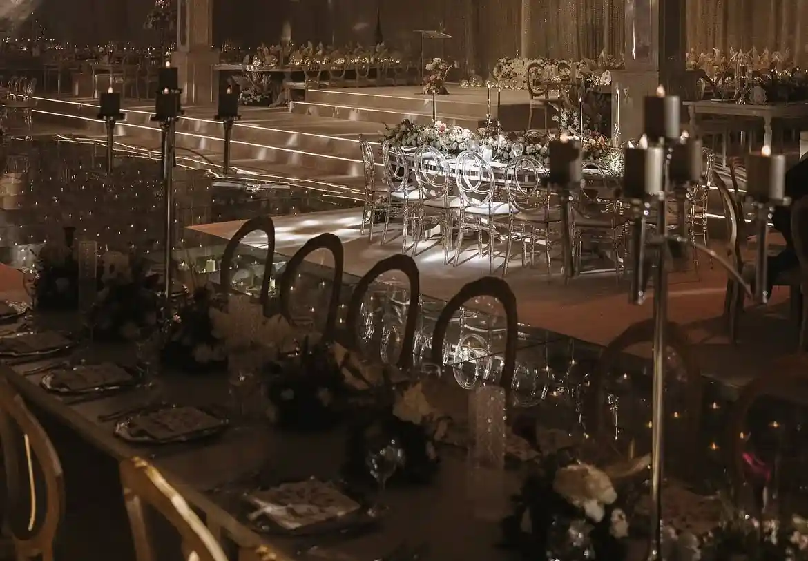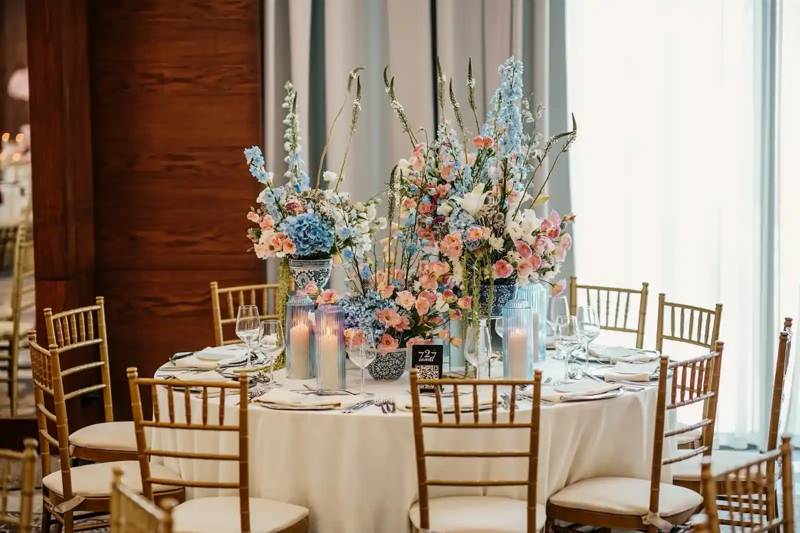
Start with the largest surfaces
Put the tablecloth and chairs on the board first, followed by the main flower colour and service pieces. Assess a small metallic detail against that background instead of choosing it alone and making the entire table follow. Include a dominant carpet, wall or stage colour if present; the visual setting does not stop at the edge of the table.
Give the metallic appearance a role
Gold or silver can be the principal accent or a quieter support for flowers. If using both, show clearly which pieces carry each appearance. One option is to repeat a metallic look across the candelabra and charger while using glass as a neutral link. This is a styling suggestion, not an assertion that every product is available in matching finishes.
Compare texture as well as colour
Reflective metal, textured glass and patterned linen can all compete for attention. If the board feels too busy, simplify one element and review it again. Where possible, examine real fabric and an available product sample together under venue lighting. A screen photograph is not a precise colour standard; gold and silver here describe appearance, not precious-metal content.
Keep one clear decision reference
Date the chosen board and add product links with notes identifying the flowers, linen and metallic appearance. Keep alternative boards separate rather than combining their photographs into an ambiguous approval. Capture the whole table and close details under the same light. If the result differs from the screen, assess lighting and neighbouring colours before revisiting the product selection.